Colour Theory
Starting out - The Colour Wheel
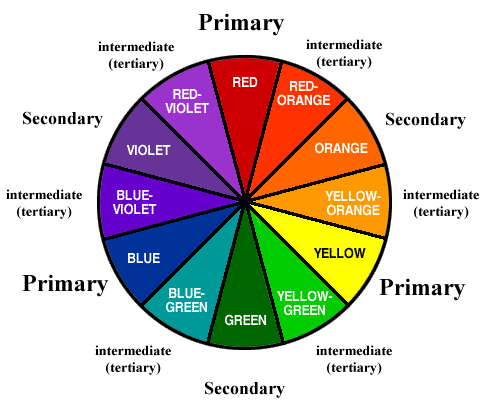
Learn how to use a colour wheel. I always see this thing posted but no one explains how the fuck it works so here's a 5 minute crash course.
This is a colour wheel. It has colours on it. Red, blue, and yellow are the primary colours. Orange, green, and violet are the secondary colours. In between these you have an infinite number of tertiary colours.
Complementary colours are the most basic of pairings. Pick any colour on the wheel and look at the colour that is directly opposite it by crossing through the centre of the wheel. Eg. the opposite of orange is blue, that means blue is the compliment to orange and vice versa. These combinations always look good together but some of them are so tired and played out (red and green) that they won't always work.
You can avoid this by doing what's called a split complementary, which is the same as a complementary but also includes the two colours right next to the complement. Eg. the split complementary of yellow is purple, violet, and blue. You can take yellow and match it with any, some, or all 3 of those colours and it will usually work.
Basically, use uncommon tertiary colours and then either complementary or split complementary combinations and you're pretty much set. Like you can actually make red and green work by using a really deep burgundy with a nice shade of olive or one of my favourites is a very burnt orange with a deep shape of navy.
P.S. None of this is set in stone but if you don't have a clue and need somewhere to start this can help a lot. It will also quickly explain to you why things like the orange and blue motif are so omnipresent in advertisements, everyone in marketing has a colour wheel. Black and white are neutral colours and go with pretty much anything but don't over use the two.
P.P.S. Be aware that some colors combinations don't work well because there is a contextual stigma with it. Black trousers and long sleeve white dress shirt are associated with waitstaff. Black trousers and short sleeve white dress shirts are associated with Mormans. Bright blue polo shirts and khakis are associated with Best Buy employees. Beyond specific uniforms there are more general associations. Saturated red and green is associated with Christmas so even though they are complementary they should be avoided (It is possible to wear them if you play around with different proportions, hues, shades and saturation levels.)
Helpful Online Tools
http://colorschemedesigner.com/ - When you arrive to this site, direct your attention to the drop-down menu at the top right. Hover your mouse over the Colorblind option, then select "Atypical Monochromatism." Go crazy with the other options.
http://www.colourlovers.com/fashion/palettes - This site is good for inspiration and nothing more. Due to the wide mix of colors, many of these palettes do not apply well to clothing. As such you should not take it too seriously. It's not advised to use more than 2 or 3 different colors in your outfit unless you want to look like you just came from Tumblr.
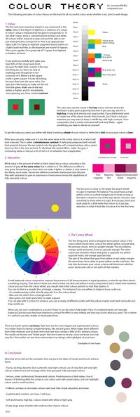
More Colour Theory - Hue, Saturation, & Contrast
The guide on the left covers hue, value, saturation, contrast, and moods.
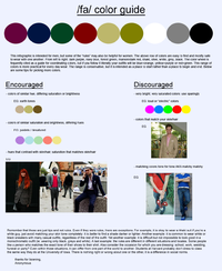
The guide on the right covers some basic colour theory in relation to clothing.


