Difference between revisions of "Colour Theory"
(This was made by user 'Hitler Youth", moving it to a broader named article so It can be expanded more) |
|||
| Line 1: | Line 1: | ||
| + | == Starting out - The Colour Wheel == | ||
| + | |||
Learn how to use a colour wheel. I always see this thing posted but no one explains how the fuck it works so here's a 5 minute crash course. | Learn how to use a colour wheel. I always see this thing posted but no one explains how the fuck it works so here's a 5 minute crash course. | ||
| Line 14: | Line 16: | ||
P.S. None of this is set in stone but if you don't have a clue and need somewhere to start this can help a lot. It will also quickly explain to you why things like the orange and blue motif are so omnipresent in advertisements, everyone in marketing has a colour wheel. Black and white are neutral colours and go with pretty much anything but don't over use the two. | P.S. None of this is set in stone but if you don't have a clue and need somewhere to start this can help a lot. It will also quickly explain to you why things like the orange and blue motif are so omnipresent in advertisements, everyone in marketing has a colour wheel. Black and white are neutral colours and go with pretty much anything but don't over use the two. | ||
| + | <br /><br /><br /><br /><br /><br /><br /><br /><br /> | ||
| + | == More Colour Theory == | ||
| + | |||
| + | [[File:Colour_Theory.jpg|left|500px]] | ||
| + | [[File:Colourguide1.png|right|700px]] | ||
Revision as of 11:26, 28 May 2013
Starting out - The Colour Wheel
Learn how to use a colour wheel. I always see this thing posted but no one explains how the fuck it works so here's a 5 minute crash course.
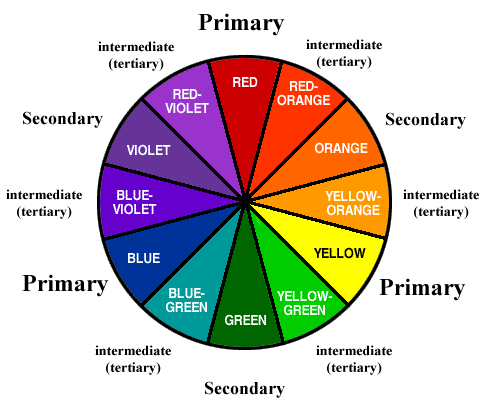
This is a colour wheel.
It has colours on it. Red, blue, and yellow are the primary colours. Orange, green, and violet are the secondary colours. In between these you have an infinite number of tertiary colours.
Complementary colours are the most basic of pairings. Pick any colour on the wheel and look at the colour that is directly opposite it by crossing through the centre of the wheel. Eg. the opposite of orange is blue, that means blue is the compliment to orange and vice versa. These combinations always look good together but some of them are so tired and played out (red and green) that they won't always work.
You can avoid this by doing what's called a split complementary, which is the same as a complementary but also includes the two colours right next to the complement. Eg. the split complementary of yellow is purple, violet, and blue. You can take yellow and match it with any, some, or all 3 of those colours and it will usually work.
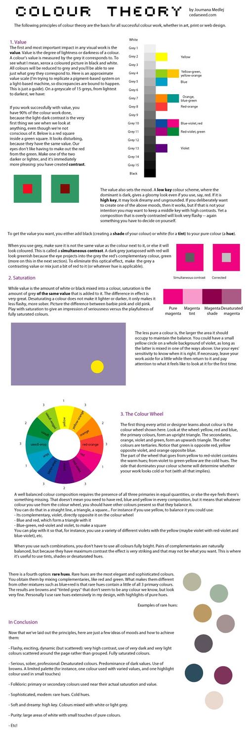
Basically, use uncommon tertiary colours and then either complementary or split complementary combinations and you're pretty much set. Like you can actually make red and green work by using a really deep burgundy with a nice shade of olive or one of my favourites is a very burnt orange with a deep shape of navy.
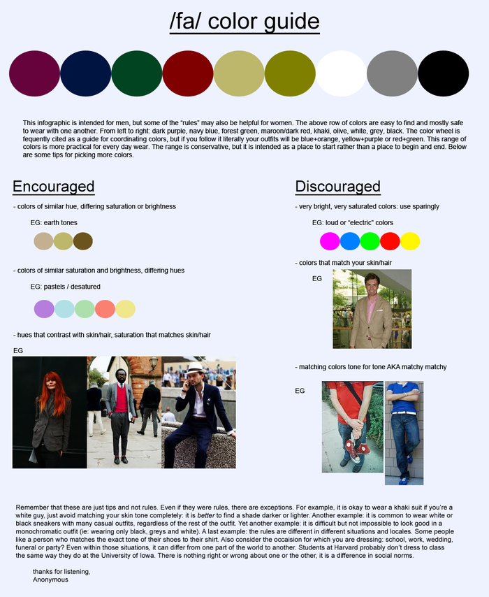
P.S. None of this is set in stone but if you don't have a clue and need somewhere to start this can help a lot. It will also quickly explain to you why things like the orange and blue motif are so omnipresent in advertisements, everyone in marketing has a colour wheel. Black and white are neutral colours and go with pretty much anything but don't over use the two.


